Search the Community
Showing results for tags 'tooltip'.
Found 1 result
-
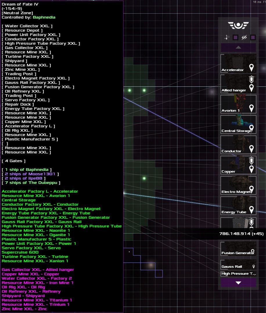
Does your home sector look like this? Do you get punched in the face by the Map UI after you intelligently put all the missing parts of an Accelerator Factory together in the same sector? The following is from a modded server, but I believe none of the mods change tooltips on the map screen. This suggestion consists of several changes to reduce tooltip bloat: 1) All stations that are mine or part of my alliance are first listed in white, then repeated in separate green and pink lists, below. Just list the stations once, to reduce the tooltip size. 2) List the stations in color, such as how the fleets of ships are listed in color based on the diplomatic relations. 3) An accessibility option for anyone who is colorblind is to use symbols for Alliance, Allies, Excellent, Good, Neutral, Bad, Hostile, Ceasefire and War to follow each station and fleet entry. Content Warning: The following is a result of two station-building sprees.