Search the Community
Showing results for tags 'ui'.
-
When I search it lags a lot for me. So I suggest the option to turn off auto typing search. When this option is off a little button to make search appears next to the search bar and or you press enter to make a search.
-
I found hidden in the little left menu a powerful tool that allows you to view different blocks by material type, combining this with the replace tool in the blocks menu allows very quick modification of craft. Within this system you have the capability to add in a 3D rendering of common landmarks, the Statue of Liberty stood out most to me. My suggestion to get to the point, could you add the capability to pull 3D renderings of our own designs to give us a sense of scale, or to view a previous design to duplicate an aspect of? Thank you very much for your consideration.
-
- building mode
- ui
-
(and 1 more)
Tagged with:
-
Some thoughts on the User Experience and the Interface
huha posted a suggestion in Suggestions & Idea Voting
First things first, I'm no UI/UX expert, barely had to do with those thematics professionally, and I'm for sure no screen designer, so I'll pass on that - concentrating more of the experience itself. All points I _personally_ think should be adressed, so take them at least with a grain of salt. Also they seem to be nitpicky for some people, but well. Everyone plays the game differently 🙂 the main screen: The arguebly most important part of the game is the fighting, so it makes sense to really highlight the positions of your enemies so you never feel lost in combat. The arrow sadly is really hard to see most of the time. Depending on the sector backdrop. I suggest making it bolder and more vibrant, adding a constrast rich outline/glow maybe The positions of the targeted entities is too far on the edge of the screen. Especially on big screens it completely falls out of view. Also the icons disappear behind the notifications on the right. So the fallback of finding out where the enemy is (because the arrow isn't visible) can also be without result when the icon is behind those bars leading to having to zoom out to find your target. And this mid fight is quite a task. It would help shoving the entity-icons onto the most front plane and/or moving them a bit more inward into the center of the screen. The optimal solution propably would be to give the user control over the distance icons/screen-edge A minor complaint I have about the notifications is the order they "bubble up" - or how they don't. The chat-box in the left-bottom corner has its newest entry always at the bottom, as chat windows normally do. My gut tells me it would make more sense if the notifications on the right also get their newest entry at the bottom, pushing the older ones one row upwards until they disappear at the top. Having the option of turning them off completely would also be nice, they DO eat a lot of screen real estate. I just realized in this tempo this post will be half a book, so I'll just write down what things I occasionally wish for - make coordinates clickable if a players posts them in the (xx:yy) format in chat - "Return All-button" for Fighters - repressing r (select target) selects next-closest target (as the tab/h-counterparts do) - alt+mouse-move repositions the camera, it would be awesome if alt-mouse wheel would push the camera out/in slightly (leaving the realm of UX now I know.) - sector coordinates in the top left corner aren't displayed when the sector has a name (dispite the loading screen telling you to look up there for the coordinates) - rebinding middle mouse button to interact would be really benefitial for accessibility. Also it would just be comfortable to be able to rebind it too 😉 other than that I like the main screen. Its clean, the fov depending on your zoom level makes sense, trying to give you the best overview for the sector. the strategy & galaxy map: I think there should be a consistent way of handling those maps which should orientate themselves on the gameplay. You are moving the ship with WASD mostly, so it would be easiest to move the maps around with those keys too. Instead we're having two completely different styles of moving the maps which is confusing to say the least. (steer your ship with wasd, steer the strategy map with arrow keys or edge-scroll, steer the galaxy map with right mouse button...) The galaxymap having had an overhaul it may make sense to adapt those changes for the strategy map. At the top of my head would that include: - selecting multiple ships by ctrl-clicking them in the right overview. - ctrl-a selects all owned entities - option to hide stations ? - It would also be nice to re-adjust the origin-plane when hitting space to focus an object (which I don't think is mentioned anywhere?). So you can actually position ships next to the target you just focused on instead of sending them 10s of km above/beneath. - the "escort me"-option from "Orders" would fit right in at the bottom of the strategy map. - The icon positions from loaded/unloaded sectors are different. Adding the "undo" icon at the top moves everything down one row for example. Which constantly results in selecting the wrong order when the sector finally loaded. I think it would make sense positioning the "undo" button at -50px on the y axis, leaving the other icons at their place. Instead of at 0px+moving all other icons 50px down (if you catch my drift? These jumping icons are driving me mad constantly :P) - Adding the most important strategy-map shortcuts (with changed keys of course. WASD is for moving ;)) on the galaxymap would be a logical additon too. (c for salvage, q for patrol and so on. I know in the strategy map they're persistant orders and on the galaxy map they're not but it still would really speed things up) - please remember the camera position when entering the strategy map and recall it after closing (same for build-mode). I could swear this behavior wasn't there before, it can really mess things up... - "sort by faction" for the sector overview entities, also some of the features of the sector overview-mod could be implemented, that stuff might be helpful in vanilla too 🙂 Dialogue/interaction system: - Using the mousewheel to scroll through the options is nice. I would love to have an "rpg"-like system too by using numbers to select the option. - the most important and unique option of every station should be the first option you can choose in the list. Scrolling down a list when visiting an equipment dock to "search for" the access to the equipment dock isn't the most intuitive thing. Things like build don't belong at the top position imho. Found station menu: - what order are the factories actually in? I still haven't figured that one out. I would like to have it alphabetically or by price at least. - give the player a way to know what a factory requires before he sits in the station founder chair. Maybe add an overview to the encyclopedia? Player menu: in general: add scrollbars or at least indicators of where you are in the list Fleet overview - hide/show stations<->ships - add "show only current sector" - add "jump to ship/station" Inventory - add "sort by price" - "no sorting" may as well be "recently added" or something - add _some_ auto-trash functionality, maybe "mark filtered as trash" - this needs a bit more thought than I can give right now. - add "post in current chat tab". not everyone needs to see your most valuable items. maybe there is some better way because you sure can't post them in "notifications" or "economy". post them always in the the current group/alliance tab for example? Missions - when a mission-succeeded mail hasn't been read yet, show a hint in the mission overview. Delete it when the mail has been read Diplomacy - its good, it works. I'll sneak in a gameplay-wise thing I wish for anyway ;): adjust and lock your reputation to someone so they cannot build a huge ship at your shipyard and then instantly have access to all your turret factories best weapons Alliance - the transfer of items should be simpler. some kind of key-modifier to at least transfer a whole stack of things instead of clicking it multiple times. (a "transfer filtered" would work here too I think, so "tesla naon" would transfer all naonite teslas to the alliance vice versa. - remember the last filtered items. as it is now the filter gets reset every time you open the window - emblem-designer: I like it for being.... unique Ship menu: Ship Overview - if you click a turret and/or drag the ship, stop rotating it for a bit longer. If you are searching for a specific turret the 4-second pause often isn't enough. - right click/drag-out a turret to remove it. dunno if this is possible being out of the build editor, but I cannot see why not - display the maximum amount of turret slots on the right, as it is displayed in the build editor - too much?: replace a turret by dragging one from your inventory into one of the boxes Crew - a button that shrinks down the section to a healthy amount, unemploying unnecessary personal - a "train missing professionals" button for the academy Upgrades - just realized it would be just consistent to add the "sort by price" here too, being basically the same menu. Although it doesn't make sense. So I would make an exception and leave it out 😛 Cargo - add a input box to drop a certain amount of items. Right now the only way to give cargo to another player is to build a separate ship with cargo capacity and fill it with the amount you want to give and then dropping the whole cargo. alternatively: add a new mechanic to transfer/trade cargo inbetween ships from player to player (dropping a certain amount still could come in handy, though) - when transfering cargo to a ship/station: at a "transfer all" for each product. Weren't there modifiers for these actions? Cannot find anything about it right now. Fighters - allow deleting a squad even if fighters are in there. Showing an alert that all fighters will be removed and you won't get anything back for it. (right now you have to drag every single fighter off the window) - show a note of how to delete a fighter in this window Transfering fighters - place fighters in a new squad when transfering the whole squad and the destination-squad being full. Right now you have to switch to the other ship, create a new squad, place that squad at the position the squad on the first ship is and then re-open the transfer fighters window to transfer the whole squad. (this is insane :D) Stations - add the "station buys consumer goods"... somewhere... right now you have to leave the station (non-factory stations), interact with it, select "trade goods", and enable/disable it with a small icon in the top right corner - same as with cargo: buy all/sell all-buttons for each product Smuggler - unbranding/selling: unbrand ALL (all like in... everything on board) and all for each product Fighter Factory - remember the last directory the player was in when building a fighter, also the last used fighter is displayed but you cannot add a turret unless you reselect the same fighter again. (remembering while in the same sector, I imagine it gets quite tricky if you re-enter the sector and something like this has to be recalled) - create a new squad automatically when there is none the fighter can be placed in instead of sayin there is no squad Will make notes from now on when I'm playing and I come across something odd or overly complicated and maybe add it here? There are also issues with order-chains in the galaxymap but I think this should have its own place so I left it out. Just some tough love for a tough game I love... -
Targeting key commands could use some enhancements
Rand posted a suggestion in Suggestions & Idea Voting
Great game, but there are still some rough edges, and this is one of them. So, targeting leaves a lot to be desired. The "nearest enemy" targeting key is useful, the "next ally" and especially "next target" less so. "Next ally" has the problem that it's one direction only. I have often missed and wanted to go back a target, but I can't. Adding a "previous ally" key, either J (next to H) or H+shift would be helpful. But "next target" is the least useful and most frustrating. First, it also has no reverse direction key command (like tab+shift, for example) but, worse, it has zero discrimination. Most of the time you are using it for one of two things: 1) looking through asteroids 2) looking through everything BUT asteroids It would make the tab targeting system much more useful if you could toggle asteroid targeting on/off. A simple toggle key with an icon showing the targeting status in the targeting window is all that would be required. Bonus points if there was a three way toggle. Everything, no asteroids, and asteroids only. Oh, yeah. I almost forgot. There are some function key commands for toggling the UI and such that don't seem to appear in any command list. It would be nice to be able to see a full key command list somewhere in-game. Either in the controls menu or an overlay (like when building).-
- ui
- key commands
-
(and 1 more)
Tagged with:
-
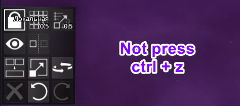
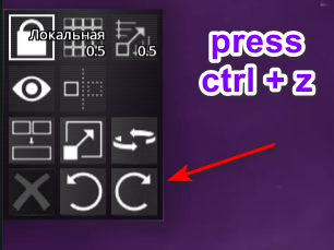
Hi there. [Description] I play on my dedicated server. This (my) server hosted on my vds. I have a one bug with game. [Bug] 1. Build mode with CTRL + Z => When I press that buttons in build mode and I try build with LBM or delete any block by "delete" button just ... nothing happen. When I do the same on local server and play on local server - all is fine. This bug "disable" some UI feedback or clicks? That means what I can't set space jump sector (idk what exactly name on eng lang), build anymore with LBM and delete blocks in build mode, also in menu like "missions", I can't accept any mission etc. [Info] Game Version: 2.0.7 d3cde408d586 (steam) OS Version: Windows 10 Server Version: 2.0.7 [Video] Check video for see what happen. If you want I can upload video on youtube. Sorry for video quality. [Tooltips] How to check when I press ctrl + z on video? avorion bug.wmv
-

Select multiple items in UI (Settings, Backups)
Baphnedia posted a suggestion in Suggestions & Idea Voting
When in the main menu, I started clearing out old galaxies, as many of the galaxies were old mod and config tests before establishing modded servers in old versions. I have maybe 50-80 galaxies left to go through, but I can only select one and ctrl+click or shift+click does not seem to allow for selecting multiple galaxies. Looking forward to being able to make multiple selections in the Settings > Backups menu. -
Just a few off the top of my hat that I'd love to see: sort by range sort by tech level sort by size/number of slots sort by number of operators required sort by damage type sort by overheat/cooldown... and I'm certain there are others that would be useful to have.
-
Builder - View: Alphabetical Block List
Maelstromeous posted a suggestion in Suggestions & Idea Voting
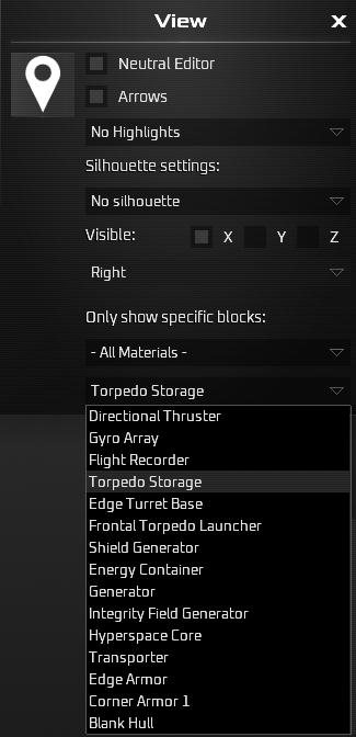
When you have many block types, the "Only show specific blocks" section for a particular block type becomes very tiresome / bothersome as the list is not alphabetical. It appears to be going newest block type added to oldest rather than alphabetical. A nice QoL change would be to make this list alphabetical.- 1 reply
-
- build mode
- qol
-
(and 2 more)
Tagged with:
-
Suggestion: Implement directional indicators in the Gate UI icons. See Simple Gate Compasses mod: https://steamcommunity.com/sharedfiles/filedetails/?id=2018219527 Posted in suggestions on behalf of Discord user Yinan.
-
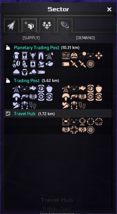
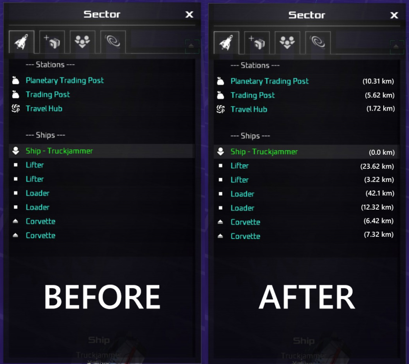
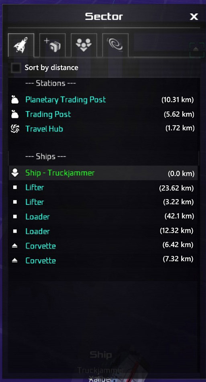
Adding distance will cut the time needed to check which station is the closest in the sector. E.g. when there are multiple shipyards and you want to get to the one nearest. Pictures are attached for mockups. MORE PICS: 1. Not right-aligned version 2. Button to toggle "Sort by distance"
- 2 replies
-
- 1
-

-
- qol
- quality of life
-
(and 3 more)
Tagged with:
-
Display the real time clock in game (and option to turn it on/off)
Khyinn posted a suggestion in Suggestions & Idea Voting
I've created a mod to display the real time but it will be cool to include this directly in the core game. The idea is to avoid using a mod especially for this because mods disable achievements. And if you consider adding such option, please also consider as an option to display time in 12 (with AM/PM) or 24h format. Please excuse my english...- 1 reply
-
- qol
- quality of life
-
(and 2 more)
Tagged with:
-
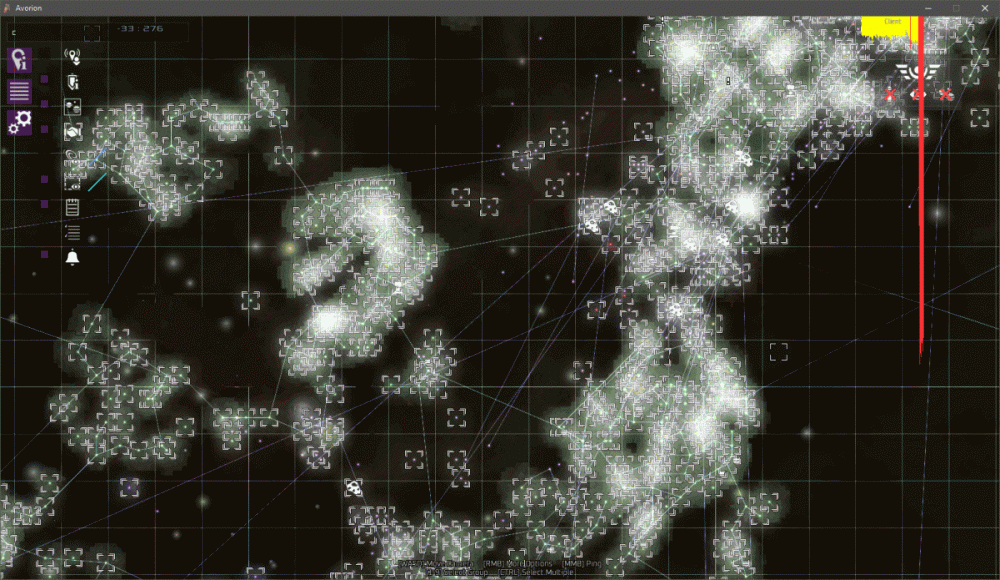
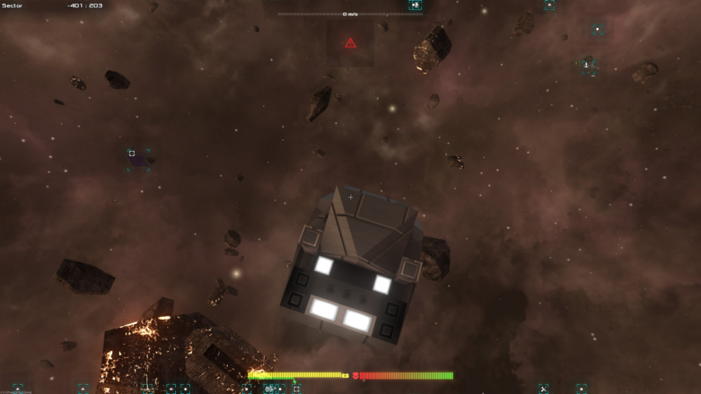
This is a screenshot from my game. As you can see, it's extremely hard to see the icons for stations in this screenshot. You might notice this if you're playing in large monitors like I am. An option to allow us resize/scale icons would be extremely helpful. By this I mean ONLY the icons, because I'm fine with the other UI elements. We already have the option to scale it. Only the icons are too small. Icon scaling should be separate from UI scaling.
-
- user interface
- ui
-
(and 3 more)
Tagged with:
-
Hello there, A financial overview would be really nice. Something like an account balance in the player menu. Maybe for resources too that would be awesome. So you can see you can see how much credits or resources were earned in which way and what things cost which amount of money/resources. For example, a "stations" category in which you would be able to see how much your stations earn you and how much they cost you. And maybe an option to manually or automatically update the balance sheet.
- 2 replies
-
- ui
- suggestion
-
(and 1 more)
Tagged with:
-
Hello everyone, I’m new to the game and I would like to offer a suggestion on fleet management. I think it would be excellent if you could have a UI menu where you can group certain types of ships together. For example a mining fleet, military fleet, and so forth. Where you could for example select them individually or select them all. This would be good if you want to attack a certain faction, or if you want to really expand mining or trading on a galactic scale. It’ll also be convenient to see for example if your mining fleet has exhausted the amount of asteroids in a particular sector. Or if prices have changed throughout a trade route and profits have changed. Or if a fleet is currently in combat. Maybe in this UI section an icon can display that the resources in that area have been exhausted. Or other icons so that the player is aware of what’s going on with each ship group. Instead of just seeing a message in the bottom left hand side of the screen. Tends to be overlooked at times on my part. Thank you!
-
- fleet
- fleet warfare
-
(and 2 more)
Tagged with:
-
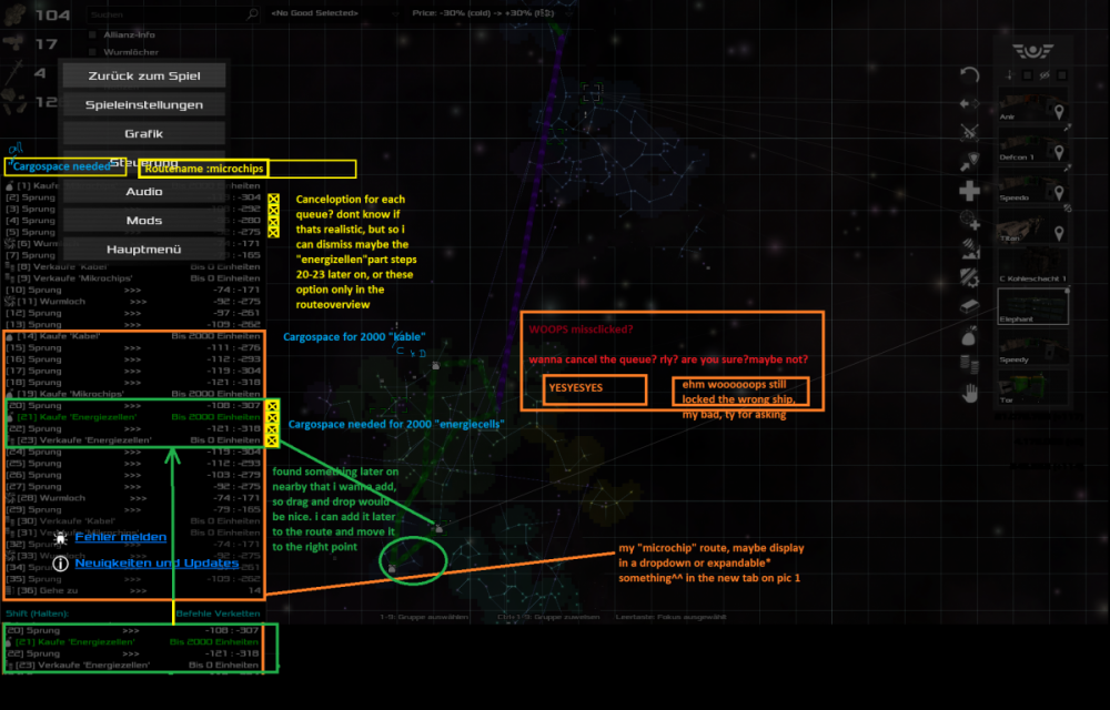
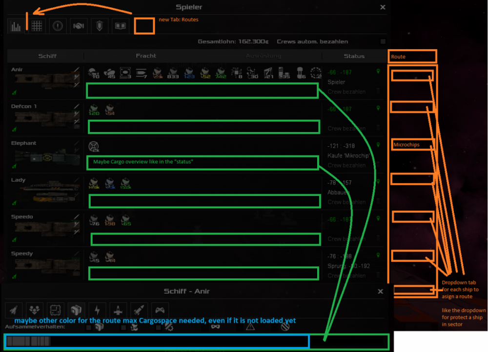
Hi there! First things first: Awsome Game. Thank you! Thanks to Mrs. and Mr. backer (Kickstarter xD)! Second: i ll try my best in english. Some ideas: I think it would be nice to rearrange the queue for the ships with a captain for maybe a trade route (queue/loop). 1. 1. If the ship has a queue already, just ask: do i wanna cancel the queue?! Sometimes i forget to „unclick“ the current ship and i have to set up the loop again. Woooops…:: "captain from the *shipname*, sir you've first said do this and do that and then this and by microchips etc, and now??? srly?" me: " Do what i say, i pay your rent" or "sry wrong number" 2. 2. Drag and drop for a long Loop (queue orders) – so you can add some route after that and put it in the right place 3. 3. Cancel some orders in a queue 4. 4. Name a Route so i can put other ships on it, „routename“ – maybe :they have to be on the route or they wouldnt start it, and may i can put some routes later on together if they fit (point 2+4) 5. 5. If i have buy orders on the route, show me the cargo ive need on the ship – i wanna buy 2000 microchips (2000x loadingspace) etc for the hole route Sometimes pics are better ;D feel free to use, ask, adjust, im excited and a bit nervous ;D My first response to a game. Greetings from Germany. Have a nice day!! (....yes paint, and print button....xDDD, translation: if i write do this and do that, i wanna do this, or it should be so- i mean, it would be a nice to have^^ dont wanna be impolite, in deutsch würde ich es höflicher umschreiben^^)
-
When making a blueprint at a turret factory all turrets are displayed. Even if they are tech 51 or 52 [edit:]low enough tech-level to not be able to be reproduced by the turret factory you are currently visiting and therefore are not relevant. My suggestion is that they should not be displayed to keep it nice and tidy.
-
Please check if the DPS sorting for Repair Turrets are correct. I was parsing through my Repair Turrets to mark potentially better gear, but I sometimes see a lower DPS on the left-most line. (PS: This applies to all the three Repair types.)
-
Currently, I'm in the process of disabling all the mods I had installed for Avorion and I have to disable dependent mods before disabling the parent mods. This is taking awhile, and I have the following suggestions: 1) Add a "disable/enable all" toggle for mods. 2) Option for selection and deselction of mod families - so if you disable a parent mod, it will also disable all the child mods. 3) Persistent scrollbar: when your mods list long enough for a scrollbar, it returns you to the top of the list which gets very annoying to have to scroll back where you were and uncheck just one more mod. Click & scroll, click and scroll gets old very quickly. 🙂 Still can't wait to try out the new DLC because I'm slow with these things!
-
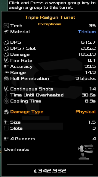
1. 'Continuous shots', 'Time until overheated' can be extremely misleading. Consider this: This turret has: heatPerSecond = 3.371 coolingRate = 1.12 simultaneousShooting = 1 Therefore, even though tooltip states 14 'continuous shots', turret overheats after first one (since all three barrels are fired at the same time, building heat to 10.113 = overheating) What bizarre is: DPS stat is actually seems to be somewhat accurate 'sustained' dps, that takes overheat & cooldown into account ( damage per shot * 3 barrels / (heat per shot / cooldown rate) = 615.95 (difference of 0.25dps is probably because of rounding of a `damage per shot` value). 'somewhat accurate', because actual sustained dps is: 608.5. Ten shots (10 intervals) takes 91.4 seconds (measured via screen capture), dealing 1853.9 * 3 damage each. 2. Hull penetration perk really needs description line "Deals from 25% to 174%, based on number of blocks penetrated" 3. For 'CoolingType.Standard' turrets tooltip shows 'sustained' dps but for 'CoolingType.BatteryCharge' tooltip shows 'burst' dps (basically firerate * damage). Meaning that actual sustained dps of all energy turrets is actually 2x/3x times lower than listed value (most of them has recharge time longer than shooting time) 4. `simultaneousShooting` is still not displayed anywhere in tooltip, making 'making sense of turret's tooltip' - extremely difficult.
-
...because when you press a first letter in the search bar, the galaxy map lights most sectors, causing it to lag tremendously for weaker computers 😰.


